


Humane Society Calendar
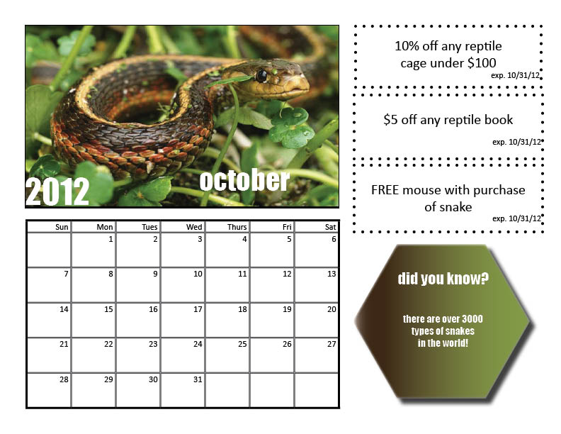
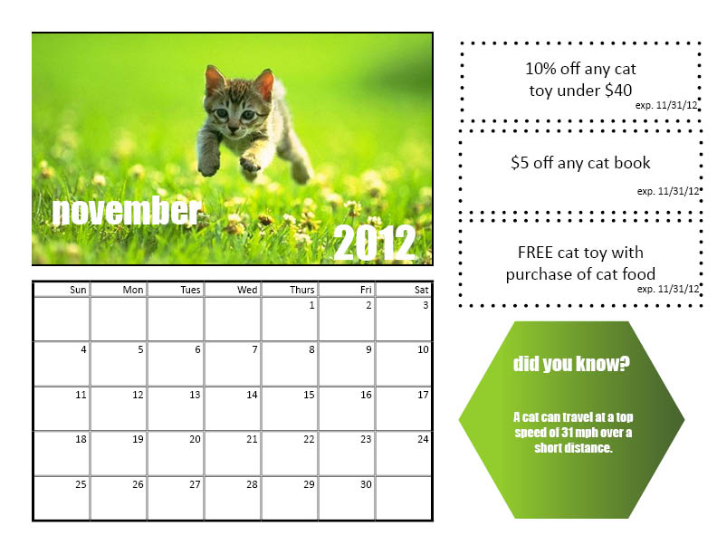
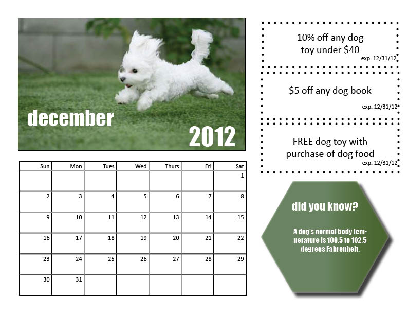
While creating the Humane Society Calendar, the main concepts I was thinking about were the principles and elements of design that would make this calendar acceptable. First off, I knew that repetition was going to be absolutely crucial given that as we turn from month to month, most calendars are almost always identical. I wanted to be sure each grid was the same size and layout so that it looked as real as possible. Also, I wanted the pictures and all the fonts to be the same size as well to have a nice flow to the pages. Along with repetition, I valued alignment for the same reason; each month in a calendar should be mirrors of each other. The coupons are stacked right on top of each other, because too many different shapes and sizes would cause the page to be too busy. I also believe I used the space properly by dividing up a certain amount for each part of the calendar. There is not one part that seems too large or overbearing, rather it all flows nicely together as they are similar sizes. I wanted to be sure that the calendar had everything a calendar calls for without being too much for the eye to grasp. I feel that I was able to design a calendar that was both attractive but not overwhelming with images and big fonts. However, with each “did you know box” I took color from the picture in the calendar and created a gradient to tie in with those same colors. I used different animals for each month because the calendar is intended for a wide audience, and each month is dedicated to a different animal so that everyone may have use for it.