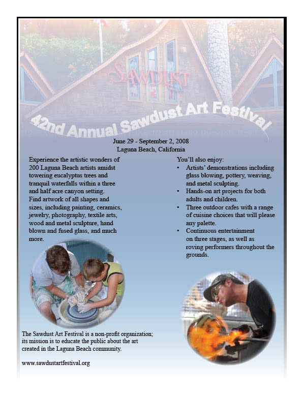


Sawdust Magazine Ad
While creating the magazine ad for the Sawdust Music and Art Festival, I paid the most attention on making an ad in which the design flows smoothly and is easy on the eyes. I used the main graphic from the festival website to ad a range of color, but faded the picture so that the wide range of colors wouldn’t dominate the whole project. The overall blue-to-white background is used from a selection of different colors from the graphic. Using shades from the graphic created a nice transitional tone, which I believe creates a nice flow to the ad. I had the most trouble with the color of the title. I intended for the title to be much bolder, however due to the selection of the gradient tint, any color selected was only something shown as white. This is something I will need to learn how to fix. I attempted to create a symmetrical design with the majority of the ad. The words start on the same side of both columns, and although the pictures aren’t placed in the same line, they do balance out the design. The text boxes have short lines and one side has bullet points because I feel that this helps with easing the reading. Overall, I attempted to make an ad that delivered all the information of the festival but also was appealing and not too busy with photos, colors and animations.